This week's best things #85
Opaque web filtering, accessibility, algorithmic power, the world's quietest room, crisis leadership, Google's year in search, and the dangers of organisational firefighting.

The weather this week has been extremely disgusting and I really wish the rain wasn't so horizontal and seemingly endless.
I am having a bunch of interesting conversations about work next year. If you want to chat about things you're considering, worried about, wrestling with, or may need a hand with then let's talk.
The audio thing I've started experimenting with seemed to spark some curiosity so here's a summary of the piece I sent earlier this week about "what happens when visitors arrive from AI summaries and answers", for those who prefer to listen.
Ok, here are some good things.
Who wins when we filter the open web through an opaque system?
Some good thoughts from Hidde de Vries.
"when people stop visiting websites directly, they're filtering content through an opaque system.[...]
There's a lot to win for companies making LLMs and agents: they could monetise via margins and data collection, and they could insert their ideologies. The ideology bit is the most new. We should want technology to benefit users first. I'm not sure if I currently trust most tech companies enough to believe that that is the case right now. “Sovereign” trained LLMs by non profit orgs? Well, possibly…"
Matthew Stasoff's 2025 review
An always-entertaining, slightly depressing, and very thorough 2025 review - mostly focused on social media stuff (primarily) but with lots to say about the wider vibes of the western world, both online and offline (it's not especially cheery - the vape with a tamagotchi was a particular lowlight).
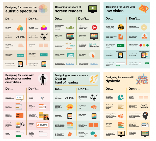
Dos and don'ts on designing for accessibility
A useful article from Karwai Pun at GDS that shares guidance about what to specifically consider when designing for various user needs such as users with low vision, users with physical or motor disabilities, users with dyslexia, and more.
Inside the World’s Quietest Room, Where No One Lasts More Than 45 Minutes
I am endlessly fascinated by the effect that 'sonically strange' environments can have on humans.
I think this all started after a visit to Emmanuel Vigeland's extremely weird museum (/mausoleum) in Oslo which, as its website says, has an "unusual and overwhelming acoustic".
Anyway, this article in Vice about the 'world's quietest room' was a good read.
"Visitors report hearing their own heartbeat, the thump of blood moving through vessels, even the faint churn of organs. Many also describe a sense of disorientation. With no ambient noise bouncing back, the brain feels unmoored. As Orfield explained to CBS, “How you orient yourself is through sounds you hear when you walk. In the anechoic chamber, you don’t have any cues.” After about half an hour, most people need a chair because their balance starts giving out. No one has lasted past 45 minutes at Orfield Labs."

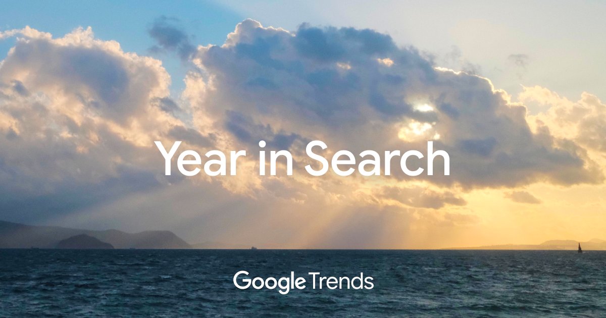
Google's 'year in search'
A fun little tool to explore various Google search trends across 2025.
Was interesting to see the top 'how to' search in Sweden was 'Hur gör man en cappuccino?' (how do you make a cappuccino).
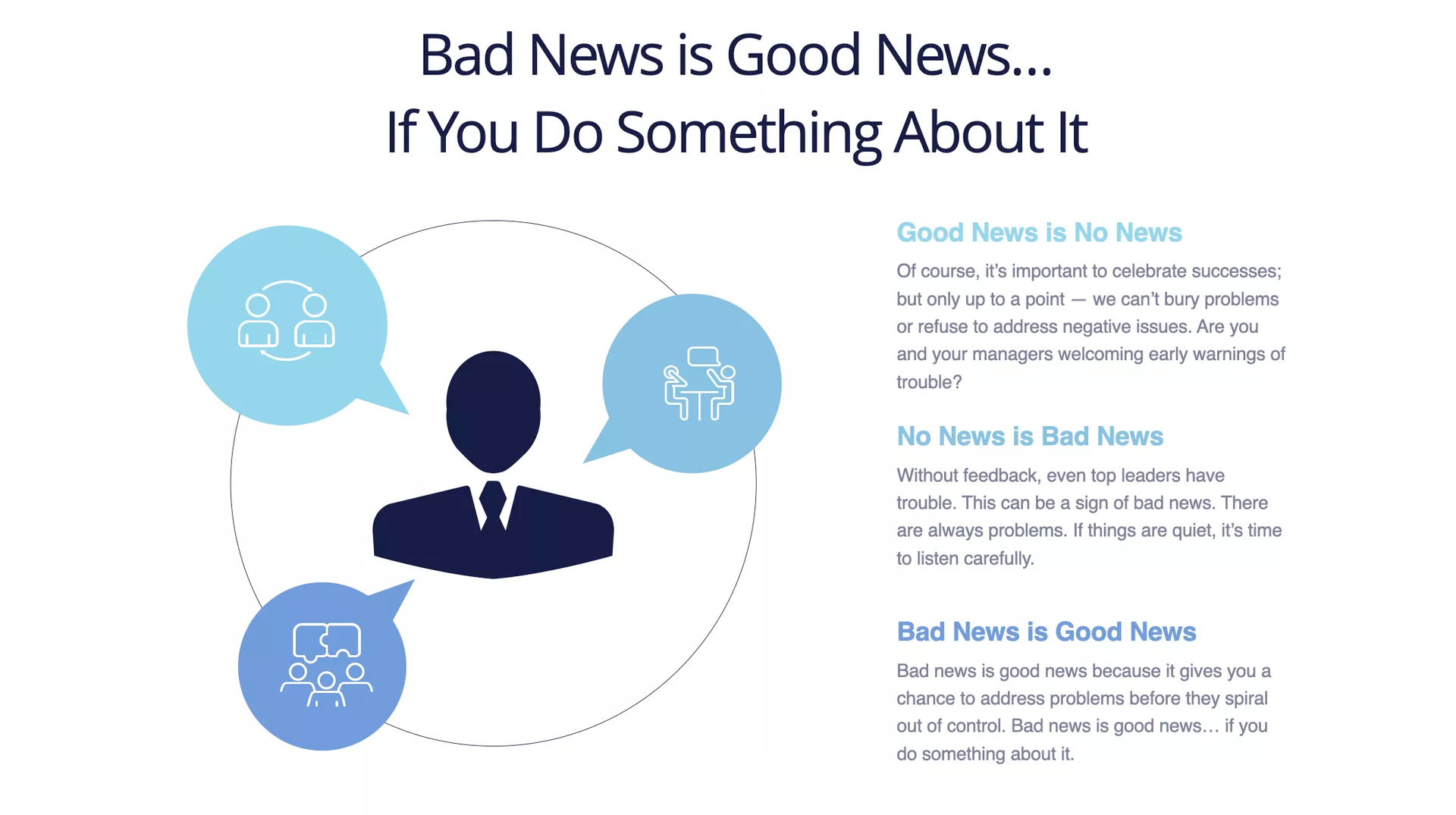
Bad news is good news
Jim Morgan once said "Good news is no news. No news is bad news. And bad news is good news — if you do something about it."
This article expands on that idea.

You don't prepare the message you prepare the people
And a few more thoughts on leadership and managing 'news' in this post from Corina Enache.
"The job of leadership should not be to manage crisis messaging but to create the conditions where people and the system grow wiser through the crisis.
That’s how resilience is built, not by polishing a script, but by strengthening the collective’s muscle. “Bad news” shouldn’t be a package a leader hands down. It should be something the community works through together. The leader’s work is to hold the space where shared meaning can form, not to carry the burden of the “right” narrative."
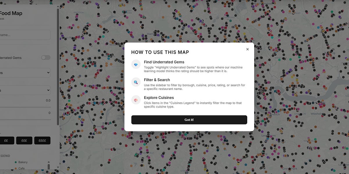
How Google Maps quietly allocates survival across London’s restaurants - and how I built a dashboard to see through it
A stark illustration of the power of recommendation algorithms told through a heroic attempt to understand how Google Maps was ranking London's restaurants.
"The public story of Google Maps is that it passively reflects “what people like.” More stars, more reviews, better food. But that framing obscures how the platform actually operates. Google Maps is not just indexing demand - it is actively organising it through a ranking system built on a small number of core signals that Google itself has publicly acknowledged: relevance, distance, and prominence.
“Relevance” is inferred from text matching between your search query and business metadata. “Distance” is purely spatial. But “prominence” is where the political economy begins. Google defines prominence using signals such as review volume, review velocity, average rating, brand recognition, and broader web visibility. In other words, it is not just what people think of a place - it is how often people interact with it, talk about it, and already recognise it."
Lauren's 'London Food Map' lives here.
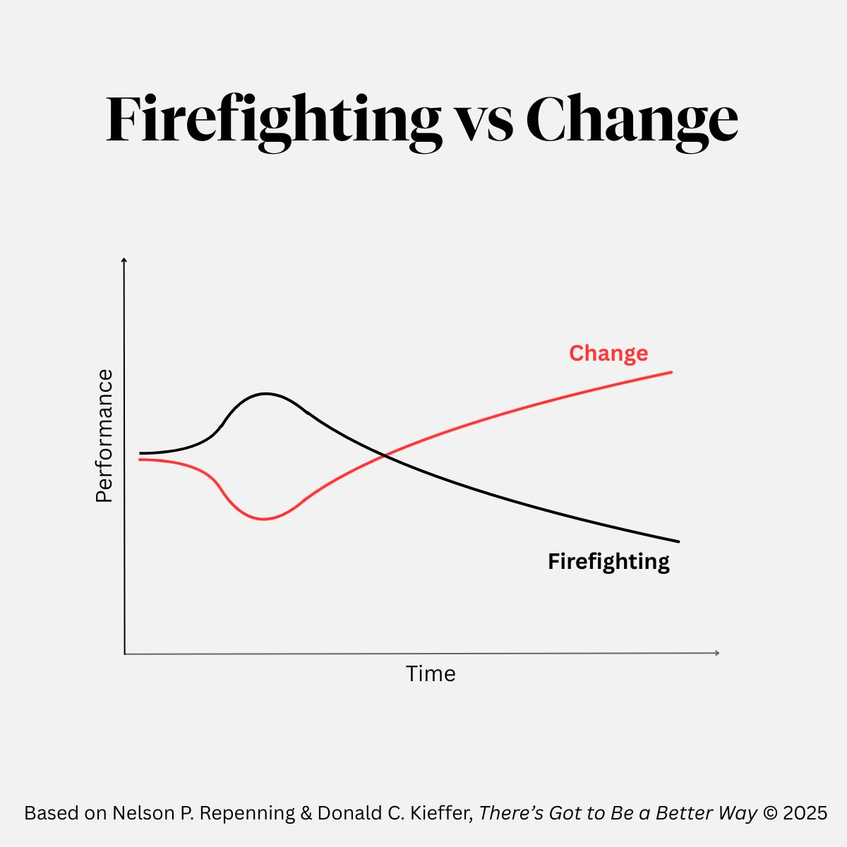
Firefighting vs change
"It’s so tempting to solve the problem in front of you in what feels like the most “efficient” way. You do what’s required in the moment, and move on.
But this risks falling into what Nelson Repenning and Donald C. Kieffer call the “The Firefighting Trap”, a situation in which the drive in organisations to get things done creates a “vicious cycle of workarounds, production pressure and increasingly short-sighted decisions”.
When we tackle symptoms rather than underlying causes, we overcome organisational challenges in the short term but compound them in the long-term. Things get “better before worse”.
When we invest the time and effort to understand and frame a problem, then develop and test solutions, it’s an immediate hit to short-term productivity but brings improvement over time i.e. a “worse before better” situation.
The challenge for most leaders is having the confidence and perseverance to brave the worse in service of the better."
Mouthful of Dust: Accessibility and UX updates
Nice little update from the team at SLV Lab in Melbourne. It explains the recent improvements they've made to the Mouthful of Dust digital experience with some useful 'before and after' examples.
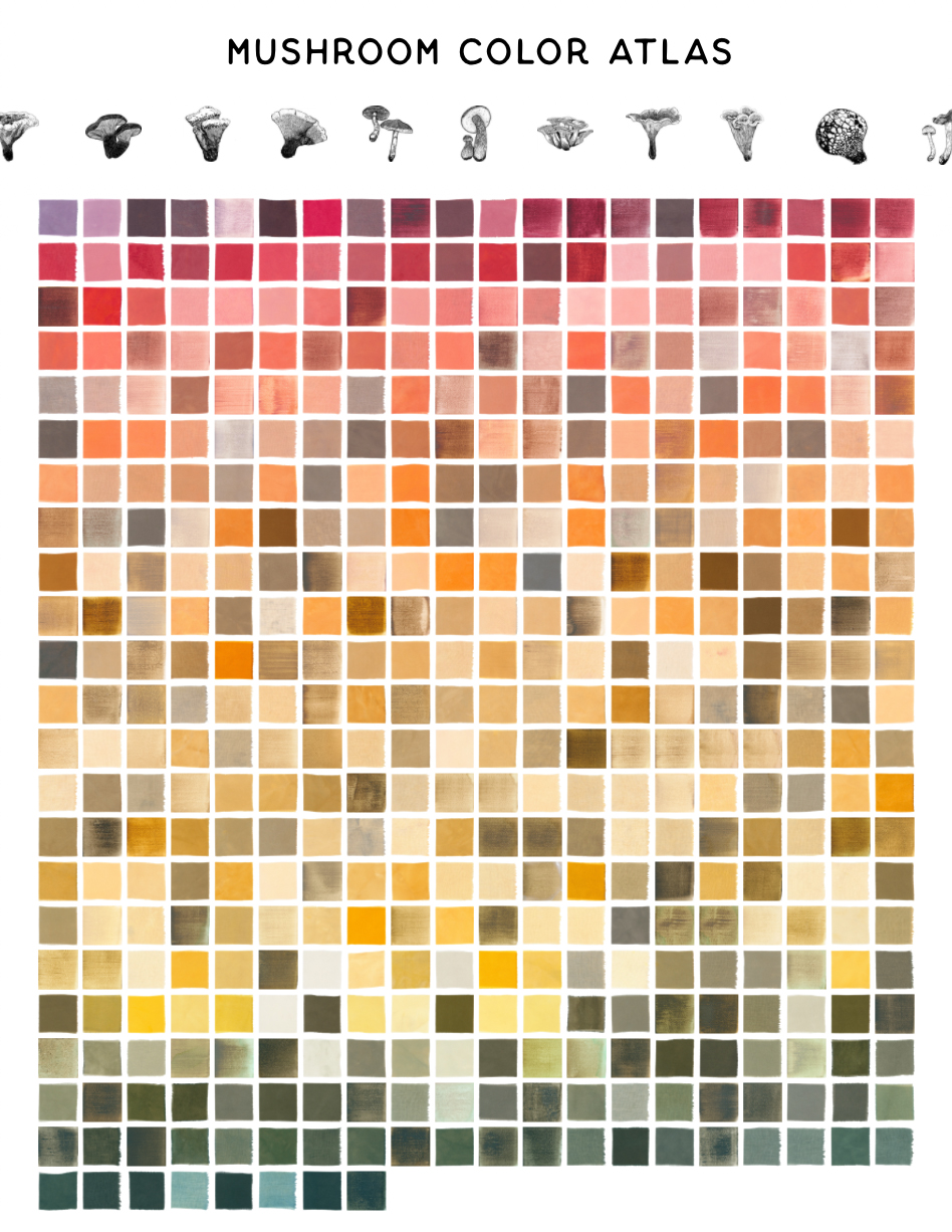
Mushroom Color Atlas
An extremely niche website about all the different colours you can get from mushrooms.
Claude for non-profits
Claude are now offering discounted pricing and free training to non-profits.
Last week's best things
The three most popular links from last week's edition were:
- This post from Donna Elkins on 'if the Sydney Harbour Bridge wore pants'
- The indie web is here to make the internet weird again
- AI’s safety features can be circumvented with poetry, research finds
This week's consumption
I finished Babel by RF Kuang which after a slightly meandering and frustrating first half was a really good read for the second half.
I've started Me Talk Pretty One Day by David Sedaris which is great.
I watched Troll 2 which was extremely stupid and forgettable.
I listened to Live God, the new live album from Nick Cave and the Bad Seeds, it's an excellent set of recordings from last year's Wild God tour (here's a video of Joy).
We also got a laughably large and rotund Christmas tree, it's almost circular it's so bushy.
See you next week for an end of year round-up
Thanks for reading all the way to the end, please enjoy a) this hand-detection-via-webcam library and b) this nice visual demonstration of variable fonts.
To finish, a quick reminder that I'm a consultant who helps cultural organisations do better digital work.
Here are some workshops I offer.
I'm also currently working with organisations on things involving:
- user research to inform digital investment priorities,
- technical strategy,
- leadership development,
- 'critical friend' advice,
- project governance,
- mentoring,
- digital strategy,
- and digital readiness.
If it sounds like I could be useful, then let's chat.