What Dobble can teach us about UX
Playing Dobble for the first time made me think about how our brains handle attention, clutter, and perception. The same principles that make the game chaotic also explain why some digital experiences feel effortless while others are exhausting.
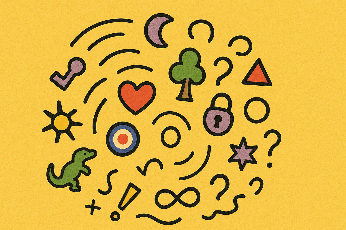
Earlier this month I played Dobble for the first time. It’s a simple, fast, slightly chaotic “card matching” game where any two cards share just one symbol. The challenge is spotting that match (and shouting it out) before anyone else does.
While I was playing, it was really interesting to notice how clearly I could feel my brain desperately trying to choose what to pay attention to and, because I am very fun at parties, I started wondering what this might tell us about user experience (UX).
1. Cognitive load and visual noise
Each Dobble card has eight symbols on it, and the goal is to spot the single symbol that appears on both cards. On every card the symbols are varied by size and position, and as a result your brain has to filter constantly - it's exhausting by design.
UX parallel: Overloaded screens create the same work - users have to scan, compare, filter and prioritise, all while trying to remember what it is they're actually looking for.
Lesson: Reduce noise and make focus feel effortless. Use visual hierarchy, consistent cues for interactivity, and sparing use of colour/motion so attention is drawn and focused, not scattered and distracted. The eye should instantly know what’s interactive, current, or relevant.
2. Perception is contextual
A symbol that’s instantly visible in one card pairing can completely vanish in another (it's a bewildering feeling). Context changes everything.
UX parallel: What people notice and understand how to use depends on the situation. A button that feels obvious on a clean page can completely disappear once there’s more stuff around it.
Lesson: Perception is not absolute, it depends on the situation. So test the experience where it will live, not where it’s designed. Check how your experiences work in the mess of real content, devices, and workflows. If something is “invisible” there then it’s invisible - the user doesn’t care how good your design reasoning is if they can’t see or understand how to use it.
3. Gestalt principles (or how our brains look for order)
When you play Dobble, your brain automatically tries to bring order to the chaos. It looks for patterns e.g. things that seem to belong together because they’re positioned close to each other, or are visually similar.
These are known as Gestalt principles, the basic rules our brains use to organise what we see so we can make sense of complex visuals.
Dobble deliberately breaks those rules around things like proximity, similarity, and continuity, which is why it feels so confusing and frantic.
UX parallel: Good design supports good UX to work with how our brains organise information by making related things look connected, separating unrelated ones, and creating clear structure so people can find what they need at a glance.
Lesson: Build on the brain’s shortcuts, not against them. Dobble shows how fragile those mental shortcuts are when visual cues break down so use consistent spacing, alignment, and grouping to make scanning effortless. If those visual cues break down, so will your users' understanding.
4. Speed vs accuracy
In Dobble, thinking too hard slows you down (sometimes it feels like the harder you look the less you see). It seems that the people who win are the ones who react quickly by spotting patterns almost automatically. The game rewards perceptual fluency - the ease with which your brain can process what it sees.
UX parallel: The same is true in digital experiences. People prefer things that feel fast and easy, even if they’re not actually simpler. When a design is clear and familiar, users move through it confidently without having to stop and think, and that feeling of ease in turn builds trust.
Lesson: Prioritise clarity over cleverness. Make tasks feel instantly doable. A well-designed interface aligns with instinctive recognition patterns rather than forcing more effortful analysis.
n.b. 'frictionless' isn't always better
5. Perceptual bias and “change blindness”
Sometimes you stare straight at the matching symbol in Dobble and still miss it because your brain simply filters it out.
UX parallel: The same thing happens online. People can overlook banners, alerts, or buttons that are right in front of them because their attention is elsewhere or fragmented. Psychologists call this change blindness or inattentional blindness - when the brain prioritises what it expects to see and quietly ignores the rest.
Think of the famous “invisible gorilla” experiment where participants who were asked to count basketball passes often fail to notice a person in a gorilla suit walking through the middle of the scene. The gorilla is there - they just don’t see it because their brain isn't primed to notice it.
Lesson: Making something bright or bold isn’t always enough. What matters is when, where, and how it appears. If people are missing something important, look at context before colour and try to surface it at the moment it’s needed, not just placing it somewhere where it seems it should be visible.
6. Learnability and familiarity
The more you play Dobble, the faster you get. You start to recognise the icons instantly because your brain builds a kind of visual shorthand for what it’s seeing. Over time, you’re not really searching anymore, you’re recognising.
UX parallel: The same thing happens with digital products. As people use a system, they develop an internal map of how it works e.g. what different buttons mean, where things live, and what to expect next. Clear, predictable patterns help make everything feel smoother.
Lesson: Don’t make users start from scratch every time. Consistency builds confidence and speed. Reuse familiar patterns, icons, and layouts so people can rely on recognition, not analysis. Save their attention for the parts that are genuinely new or meaningful.
But there's also an interesting twist in this idea - this is also why your most engaged users might swear there’s “nothing wrong” with a clunky, old website. They've built such strong familiarity with it that any friction becomes invisible to them. For these users, change (even for the better) can feel worse, at least at first. When gathering feedback, remember that high levels of familiarity doesn’t always mean better insights - it can sometimes just mean stronger habits.
In the end…
Anyway, I lost most of the rounds.
Turns out knowing why your brain is failing doesn't actually help you win.
But it's a good reminder that the visual noise, competing demands on attention, and cognitive overload that makes Dobble fun are what can make digital interfaces and experiences exhausting, and infuriating.